Table of Content
jQuery project boilerplate
Starter kit
At the end, we will have a starter kit for our future jQuery mobile app example. If you just want the starting point, you can download the starter kit and skip this page.
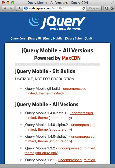
A bundle of the jQuery mobile codes and images can be download at the official website. Or this direct link to the 1.3.2 zip file. If you just need the code, you can go to http://code.jquery.com.
We will use the latest jQuery 2.x stable version. For development purpose, we will use the uncompressed version.
At the time of writing, the jQuery file is http://code.jquery.com/jquery-2.0.3.js.
For jQuery Mobile, we need the JS file / CSS styling file and the images for icons.
Then we prepare two empty files — app.js and app.css.
And at last, we create an index.html file as the entry point.
 1<!DOCTYPE html> <!-- HTML5 doctype -->
 2<html lang='en'>
 3  <head>
 4    <meta charset='utf-8'>
 5    <!-- viewport for mobile browser -->
 6    <meta content='width=device-width, minimum-scale=1, maximum-scale=1' name='viewport'>
 7    <title>Project</title> <!-- change to project title here -->
 8    <link href='vendors/jquery.mobile-1.3.2.min.css' rel='stylesheet'>
 9    <link href='app.css' rel='stylesheet'>
10  </head>
11  <body>
12    <div data-role='page' id='root'>
13      <div data-role='header'>
14        <h1>Project</h1>
15      </div>
16      <div data-role='content'>
17        <!-- content here -->
18      </div>
19    </div>
20
21    <!-- JavaScript at the bottom -->
22    <script src='vendors/jquery-2.0.3.js'></script>
23    <script src='vendors/jquery.mobile-1.3.2.js'></script>
24    <script src='app.js'></script>
25  </body>
26</html>
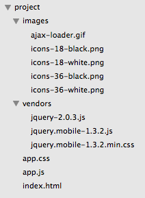
At this point, we should have the following file structure.
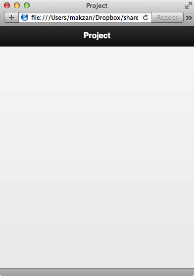
And here is the screenshot of the current stage.
Explaining
Before going further, let’s take a look at the index.html file.
It is an HTML5 document. We know that by the DOCTYPE.
In the head, we have the following meta tag to make the HTML rendering fits the mobile device’s width.
1<meta content='width=device-width, minimum-scale=1, maximum-scale=1' name='viewport'>
The width=device-width tells the browser engine to follow the real devise width instead of using a fake one. Why would the browser use something other than the device with? It is because it wants to present the traditional desktop website in an overview:

But when we visit website that set the width=device-width, we get the webpage rendered fitting the device width.
jQuery mobile page
In most cases, jQuery mobile is a single webpage app. That means all the views we need is in the index.html file. jQuery uses <div> tag with data-role=page as a full screen page.
In each page div, we defile an ID so we can reference and link to the page later.
data-* attribute. The most obvious one is the data-role which tells jQuery mobile how this block of content should be presented. Is it a full screen container? Is it a header with dark background? Or a footer placed at the bottom?Inside each page, we can have header, content and footer. And they are defined by data-role too.
So how jQuery mobile works?
- At the beginning we describe the role of each key elements and the related options via the
data-*attribute. - When jQuery mobile executes, it scans the whole document to find these key elements and apply both CSS styles and JavaScript event listenings.
- The final result is our elements with additional classes attached with their theme style.
This is just a quick to setup our boilerplate project file. These files will be used as the starting point in most future examples.
What’s next? We’re going to take a look at “Project 1 – Twenty Five Timer”.