Table of Content
Interchangable content
Responsive design comes with a downside: It wastes (mobile data) bandwidth if a lot of information is hidden in small screen. And it slows down the page loading.
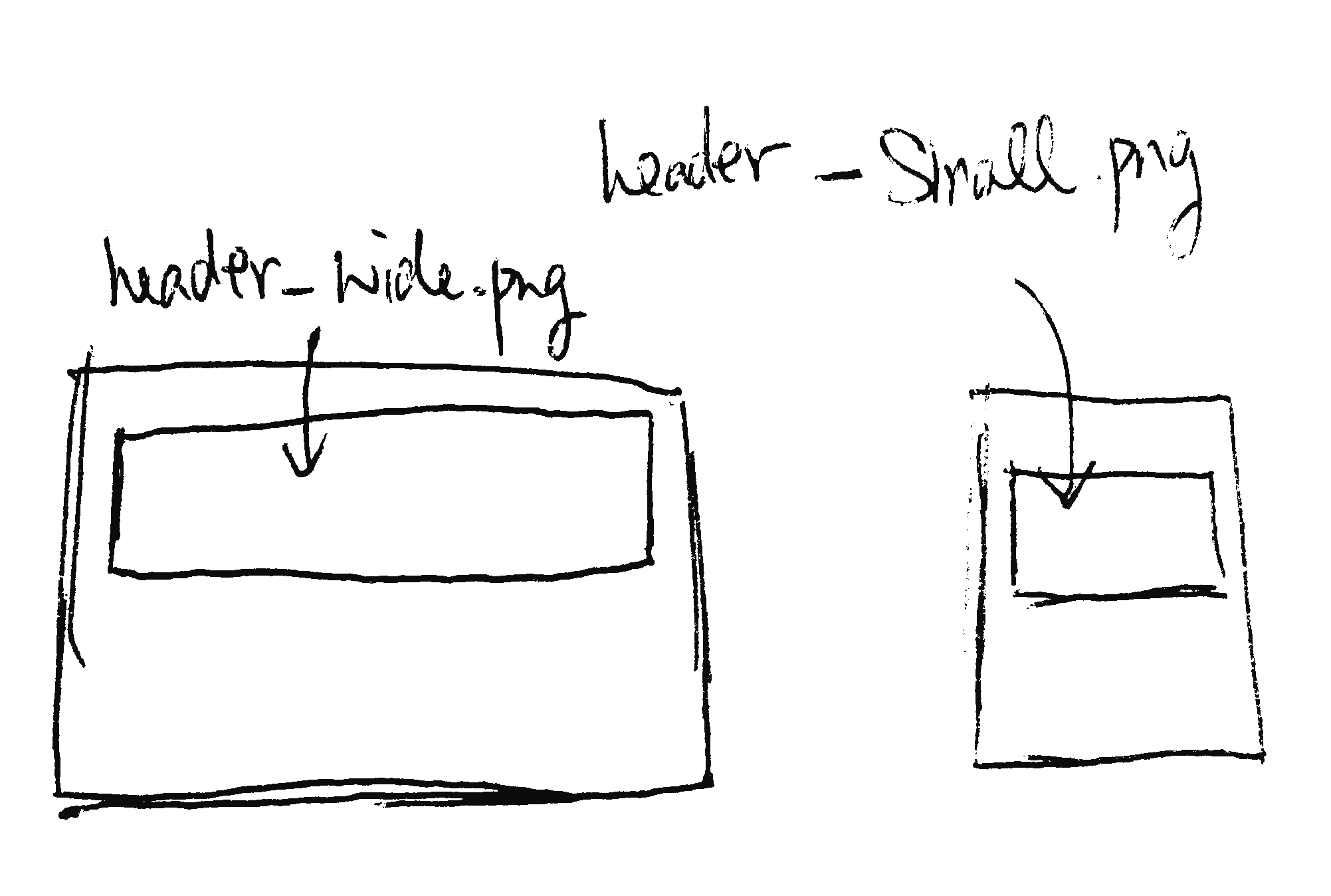
An optimal way to archive the same effect is by using interchange. We use javascript to load the image at the size that fits the reader's screen. Smaller image for small screen. Higher resolution image for larger screen. The readers only need to load what they are going to read. They should never load something that they don't see and use.
The reason we need to interchange content is because of the loading bandwidth. In the visibility section, we show and hide content based on the screen size. But the reader have to download all the content. Assuming the reader is reading on mobile but we load a large image for large screen reader. Then the mobile reader needs to download a high resolution image with the cecular data but never see this image.
Demo:
Foundation website provides a detailed tutorial on using the interchangable content in different scenarios. Ensure to check it out.
Exercise Time
What’s next? We’re going to take a look at “Assignment”.