Table of Content
Foundation topbar
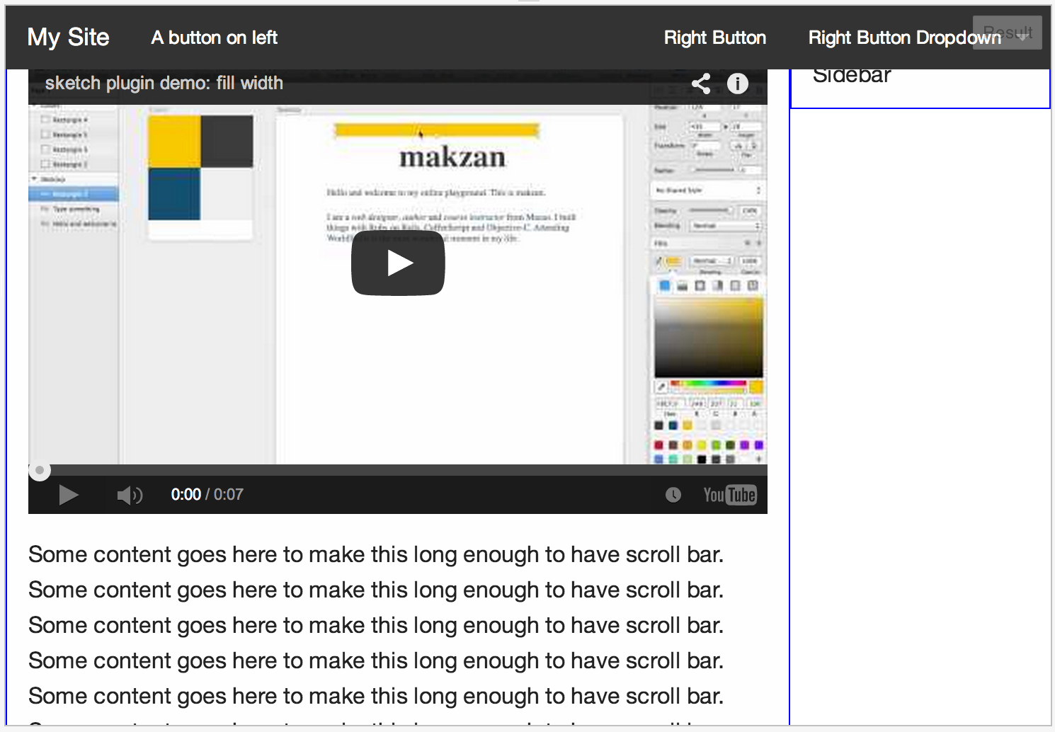
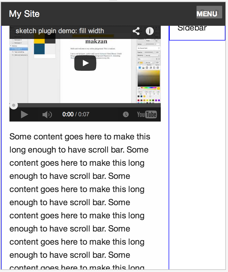
Foundation comes with a topbar wit navigation supports. Tt is quite useful for website with minimal header. The navigation items are displayed in wide screen and then hide into a menu button in small screen.
Here is the result of the same top bar displaying in both desktop and mobile.
A basic example:
 1<nav class="top-bar" data-topbar>
 2  <ul class="title-area">
 3    <li class="name">
 4       <h1><a href="#">My Site</a></h1>
 5    </li>
 6    <li class="toggle-topbar"><a href="#"><span>Menu</span></a>
 7    </li>
 8  </ul>
 9  <section class="top-bar-section">
10    <ul class="right">
11      <li><a href="#">Right Button</a></li>
12      <li><a href="#">Another button</a></li>
13    </ul>
14  </section>
15</nav>
A full example:
 1<div class="sticky">
 2  <nav class="top-bar" data-topbar>
 3    <ul class="title-area">
 4      <li class="name">
 5        <h1><a href="#">My Site</a></h1>
 6      </li>
 7      <li class="toggle-topbar"><a href="#"><span>Menu</span></a></li>
 8    </ul>
 9    <section class="top-bar-section">
10      <ul class="left">
11        <li><a href="#">A button on left</a></li>
12      </ul>
13      <ul class="right">
14        <li><a href="#">Right Button</a></li>
15        <li class="has-dropdown">
16          <a href="#">Right Button Dropdown</a>
17          <ul class="dropdown">
18            <li><a href="#">First link in dropdown</a></li>
19            <li><a href="#">Second link in dropdown</a></li>
20          </ul>
21        </li>
22      </ul>
23    </section>
24  </nav>
25</div>
For more examples, please take a look at the Foundation documentation.
Note: Using the Foundation top-bar doesn’t mean it has to be in black background. This tutorial by Mark Teekman shows how we can customize the top-bar.
What’s next? We’re going to take a look at “Off canvas”.