Flex video

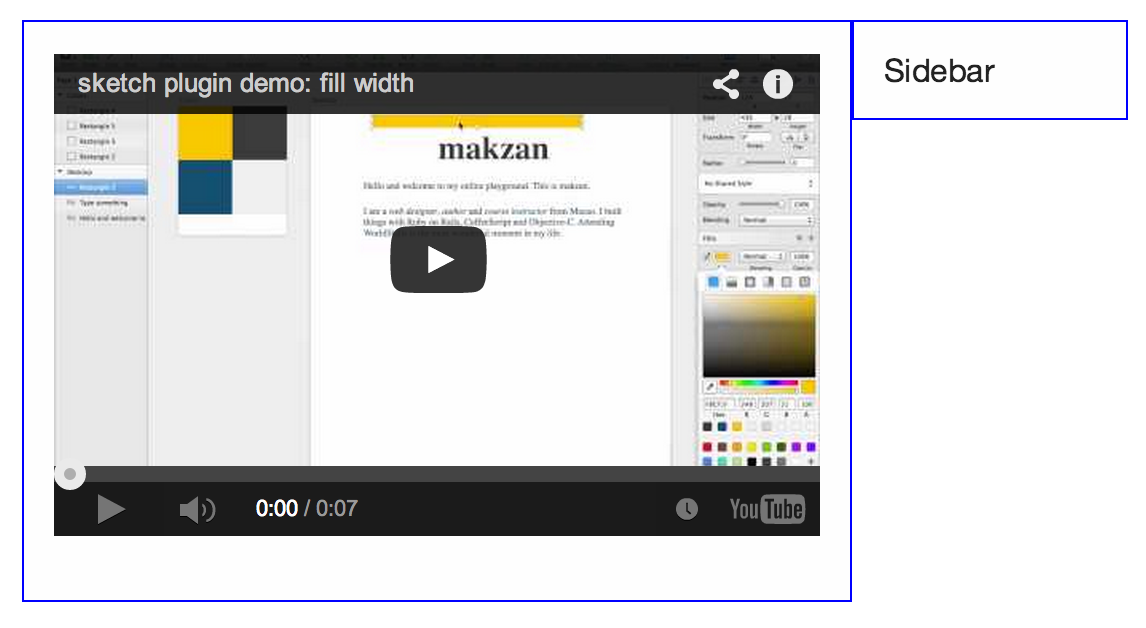
Here is a demo showing the usage of flex-video class from Zurb Foundation. It keeps the proportion of the embed video player, resulting in a much better looking in various screen sizes.

An extra widescreen class would make the hight calculation uses the widescreen ratio.
1<div class='row'>
2  <div class='small-9 columns'>
3    <div class="flex-video widescreen">
4      <iframe src="//www.youtube.com/embed/KBA4IzyEUDU?rel=0" frameborder="0" allowfullscreen></iframe>
5    </div>
6  </div>
7  <div class='small-3 columns'>Sidebar</div>
8</div>

Flexible video
Flexible video

What’s next? We’re going to take a look at “Foundation topbar”.

overlaied image when clicked on thumbnail

Makzan | Mobile web design | Table of Content