Table of Content
Foundation grid
Foundation uses row and columns approach for the layout.
Rows are the space lay out from top to bottom.
Columns are the space inside each row, lay out fro left to right.
If the content are meant to be inside the grid system, make sure we put the content inside column and columns inside row.
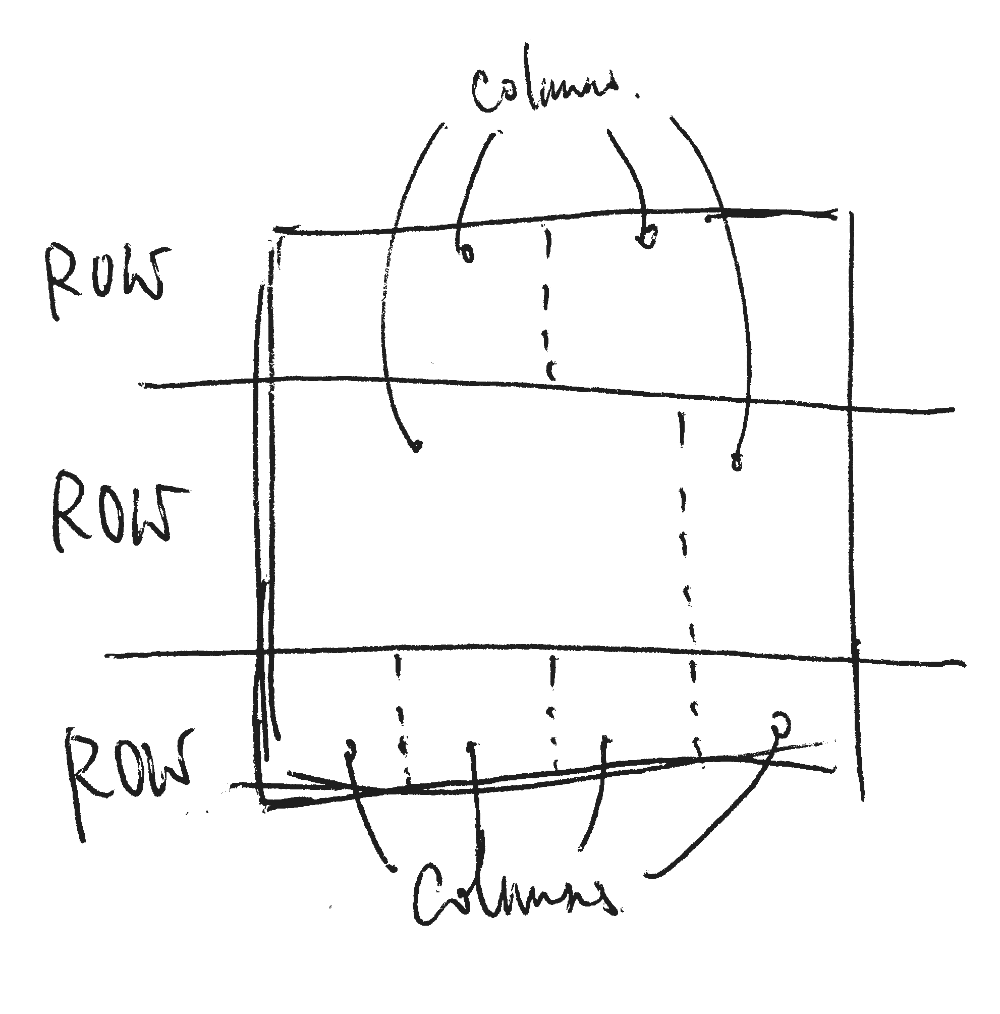
The columns order from left to right following the order of the divs by default. we may change the order by using push and pull classes where we will discuss very soon.
Here is a demo for the basic grid.


After we add the medium columns setting, the propotional varies between small and medium screen.


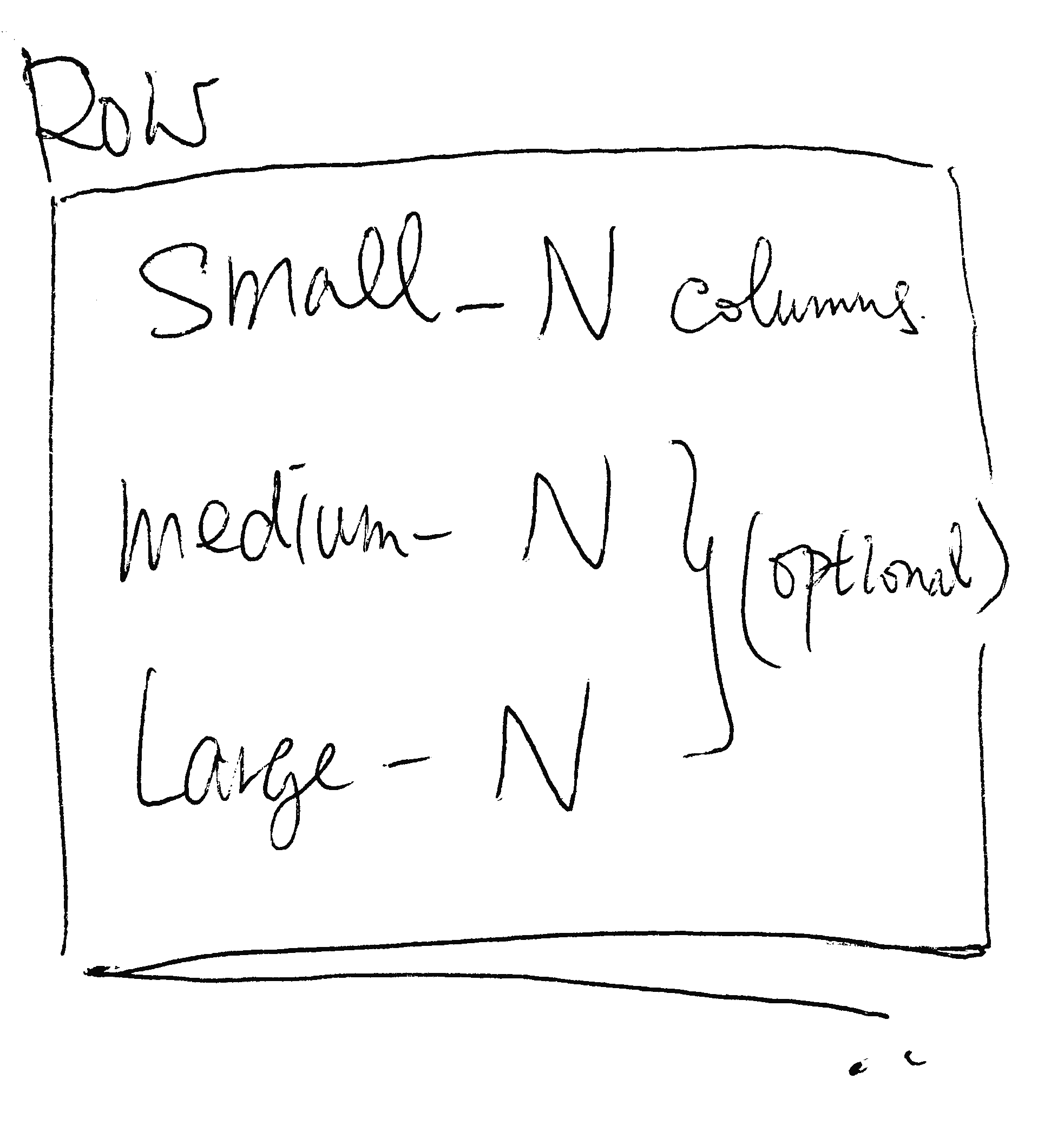
Foundation is mobile first. Zurb Foundation uses small-N, medium-N and large-N to define how many columns span for small, medium and large screen. But only the small one is required, medium and large one is optional.
When designing the grid in Zurb Foundation, we craft the grid for small screen first.
If the grid for small screen work in larger size (medium and large), we don’t need to do anything and it will expand to the larger width until reaching the max width.
If we think we should devide the row into different columns when the screen is at medium or large size, we can further use the medium-N and large-N column class to define them.
We can even provide different proportion for the various screen sizes.
What’s next? We’re going to take a look at “Centered column”.