Table of Content
Styling inputs for mobile
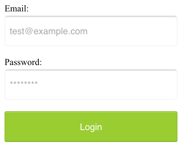
Touch device requires a very different styling approach for inputs. Inputs in touch devices are usually bigger and easier for tap and select by fingers. An easy step is to make the font size and padding larger, via the following CSS.
The default button would be too small for tapping, we would make the button larger. We also make it look like a button by adding hightlight and shadow on the normal, hover and active states.
 1input[type="submit"],
 2input[type="button"]{
 3  appearance: none;  /* for mobile safari */
 4  background-color: YELLOWGREEN;
 5  color: white;
 6  border: 1px solid rgba(0,0,0,.1);
 7  border-radius: 3px;
 8  box-shadow: inset 0 1px rgba(255,255,255,.3), inset 0 -1px rgba(0,0,0,.1);
 9
10  &:hover {
11    background-color: darken(YELLOWGREEN, 10%);
12    box-shadow: inset 0 1px rgba(255,255,255,.7), inset 0 -1px rgba(0,0,0,.1);
13  }
14  &:active {
15    background-color: YELLOWGREEN;
16    box-shadow: inset 0 -1px rgba(255,255,255,.1), inset 0 1px rgba(0,0,0,.1);
17  }
18}
You may try the demo in this CodePen.
What’s next? We’re going to take a look at “Styling radio button”.