Table of Content
Adaptive copywriting basecamp
It's not only about layout. We should also take care of our copywritings.
Here shows an example on Basecamp homepage. Please focus on the text in the top navigation.
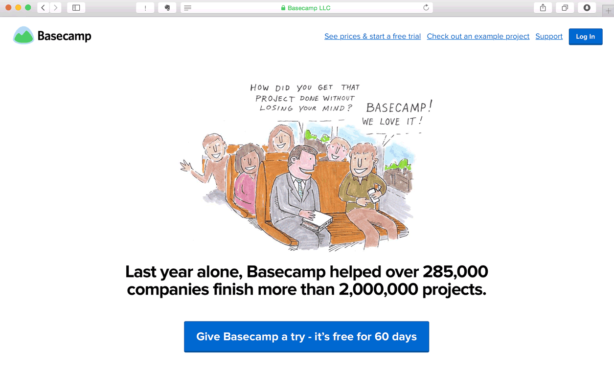
Take a closer look on the top navigation. When the screen has more space, the copywriting of sign-up button is “See prices & start a free trial”, detail enough so I know what information to expect after the link, right? When the screen has less space, this link changes to a simply “Sign up” text. Short and precise enough.
Let’s take a look at another example. Here is the Signal vs. Noise from the same company. Take a look at the top sentense.
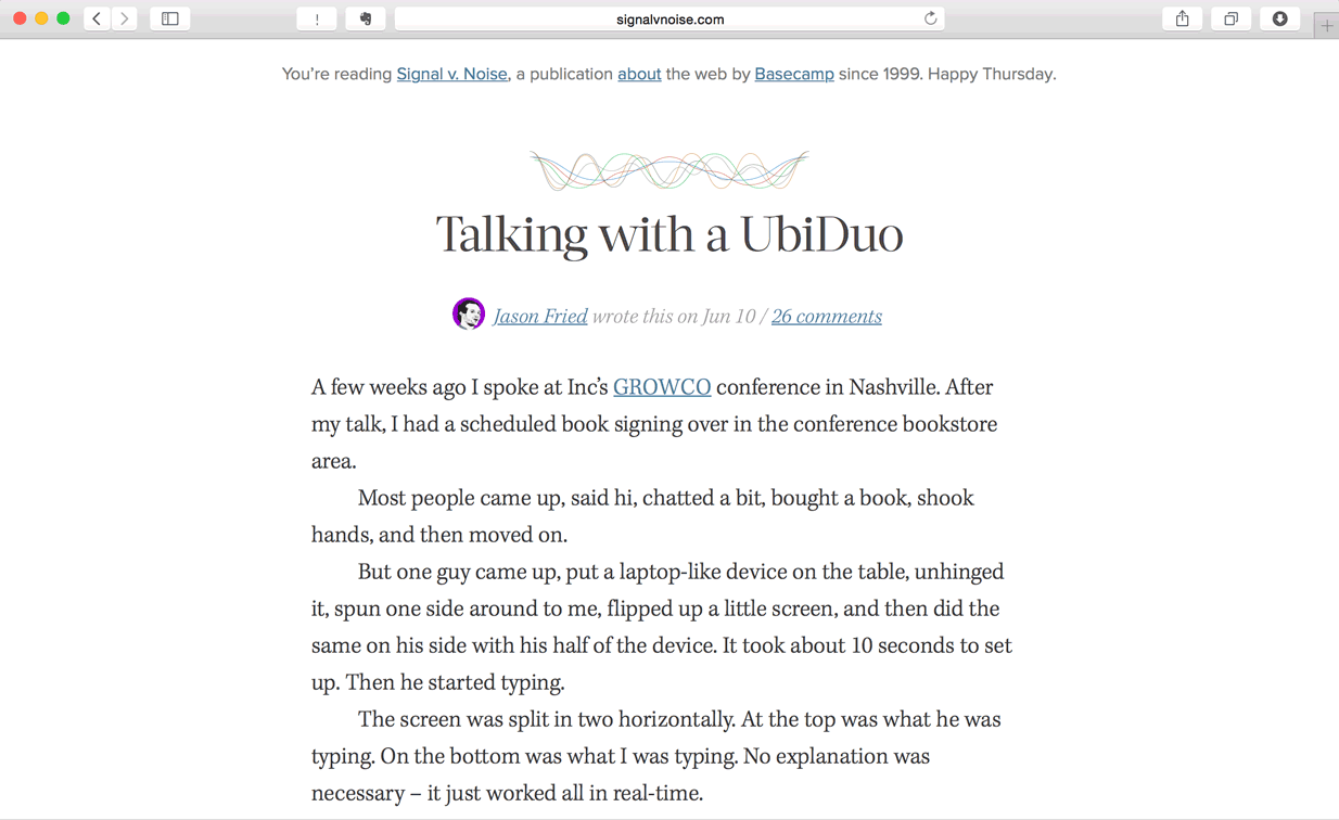
When wide enough, it shows:
You’re reading Signal v. Noise, a publication about the web by Basecamp since 1999. Happy Thursday.
When it’s not wide enough, it shows:
Signal v. Noise, a publication about the web by Basecamp since 1999.
In extreme case that the screen is too narrow, it displays:
Signal v. Noise by Basecamp
What’s next? We’re going to take a look at “Adaptive copywriting for different screens”.