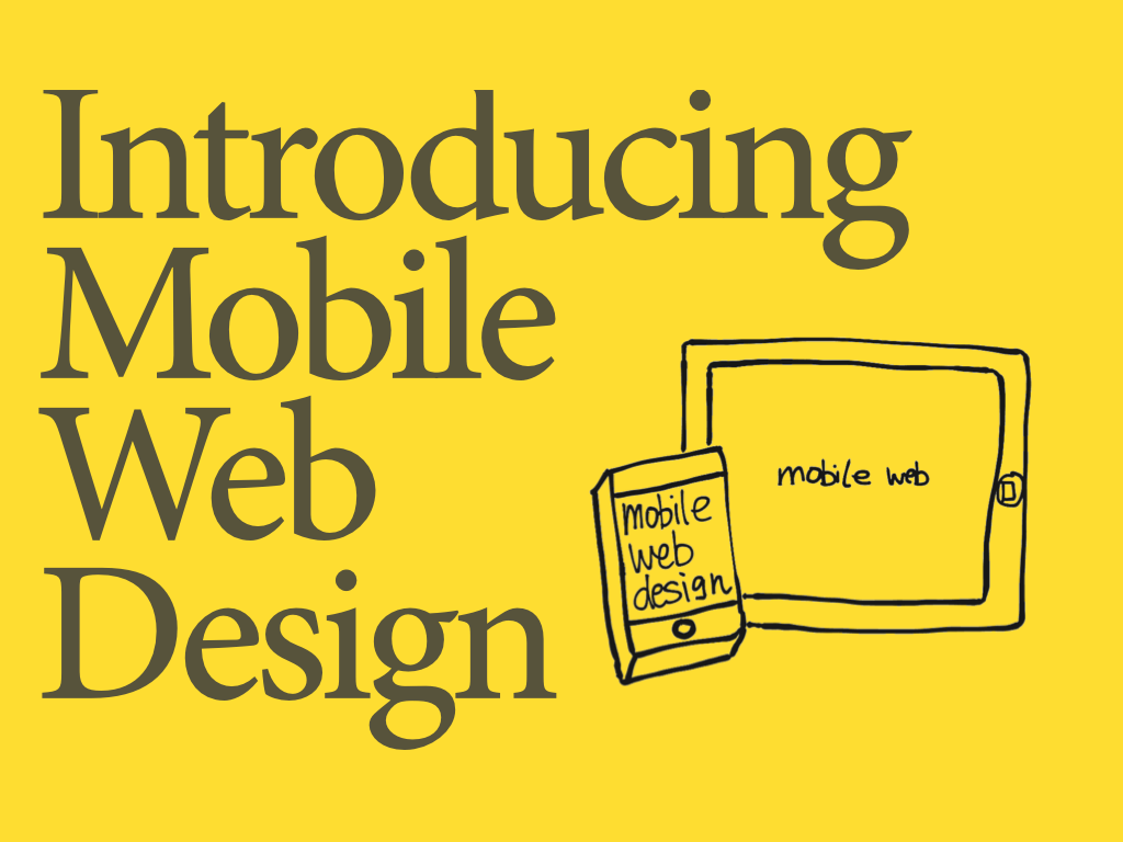
Mobile Web Design
Hi there, this is Thomas (aka. Makzan on the web). I am an author on web technology and game design. This is a course about making website that works in mobile devices.
Table of Content
- Prefix
- Chapter 1 – Getting Started
- Chapter 2 – Content Strategy
- Chapter 3 – Using Zurb Foundation
- Chapter 4 – Responsive with Media Query
- Chapter 5 – CSS Preprocessing
- Chapter 6 – Typography
- Chapter 7 – Handling Touches
- Chapter 8 – Form Inputs
- Chapter 9 – Taking the Web Offline
- Chapter 10 – Create Dedicated Mobile Website
- Chapter 11 – Packing the Web as App
- Chapter 12 – Summary
Overview
In this course, we will explore different techniques to create our content in mobile web. We will focus on content strategy for mobile devices. We will try to fit our layout into small screen. We will make the form inputs fit the virtual keyboards in touch devices. We will fetch device data such as raw touches events and device orientation. Finally, we will pack and deploy our web.
Course Style
In my course, I focus on the concept rather that listing all the specs here. It's because you can find the official spec from Mozilla or W3C. My value here is to show how things are designed and why it is designed like that. It's about the concept that you apply in your practical work.
I used to use examples to during the learning journey. You may find the code example repository on this Github repo.
In case you have any questions, you may reach me via the chat box below the web page. If I’m away from keyboard, you may leave a comment or send me emails.
Chapter 1
Getting started.
Chapter 2
Content is king.
- Document title
- Content strategy
- Content structure
- Mobile first approach
- Sketching for mobile web
- Minimal mobile friendly website
- List view
- Do mobile web has to be a webpage?
Chapter 3
The modern CSS framework.
- Trying Zurb Foundation on jsFiddle
- Setting up Foundation
- Foundation grid
- Centered column
- Push and pull column
- Block grid
- Flex video
- Foundation topbar
- Off canvas
- Interchangable content
- Assignment
Chapter 4
The core of mobile web design.
- Recap – Minimal mobile friendly website
- Using viewport to define initial browser rendering
- Using media query to define styles with condition
- Navigation strategy for small screen
- Putting navigation at bottom
- Building our own grid system
- Introducing Ungrid – Another minimal grid approach
- Media queries in Zurb Foundation
Chapter 5
Adding logics to CSS.
- What is Proprocessor?
- Preprocessor options
- Nested styles
- SCSS variable
- SCSS mixin
- Using loop to define grid
Chapter 6
Providing a good reading experience.
- Different font sizes
- Reading distance and font size
- Adaptive copywriting from Basecamp
- Our own adaptive copywriting
Chapter 7
Chapter 8
Styling form inputs for mobile.
- Specify input types
- Styling inputs for mobile
- Styling radio button
- Styling input range
- Using file button
Chapter 9
Taking the web offline.
Chapter 10
Create dedicated mobile website.
- Quick prototyping with online code editors
- One page application
- Link between pages
- Page transition
- jQuery mobile button
- UI Action Flow
- UI flow exercise
- List view
- Customizing jQuery Mobile
Chapter 11
Packing the web as application.
Chapter 12
Summary.