Table of Content
Chapter 5 – Media queries and responsive web designing
What is responsive web design?
Web designer used to ask: What screen resolution is dominant one?
- 15” 1024 x 768
- 19” 1280 x 960
- 23” 1920 x 1080
In reality, this is not the question: What screen resolution is dominant one?
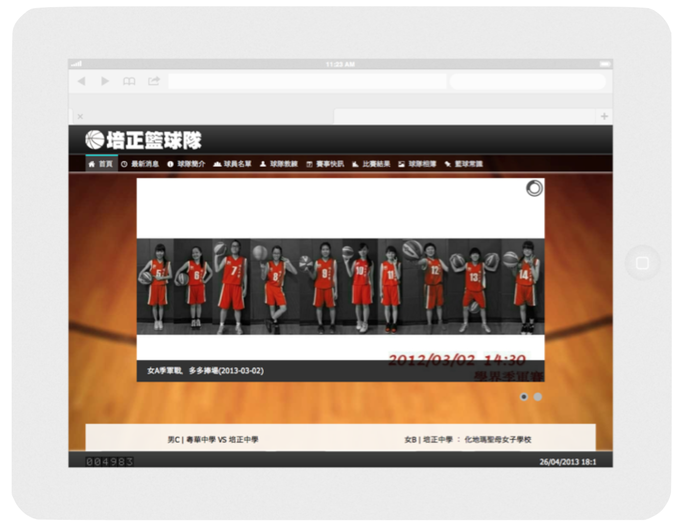

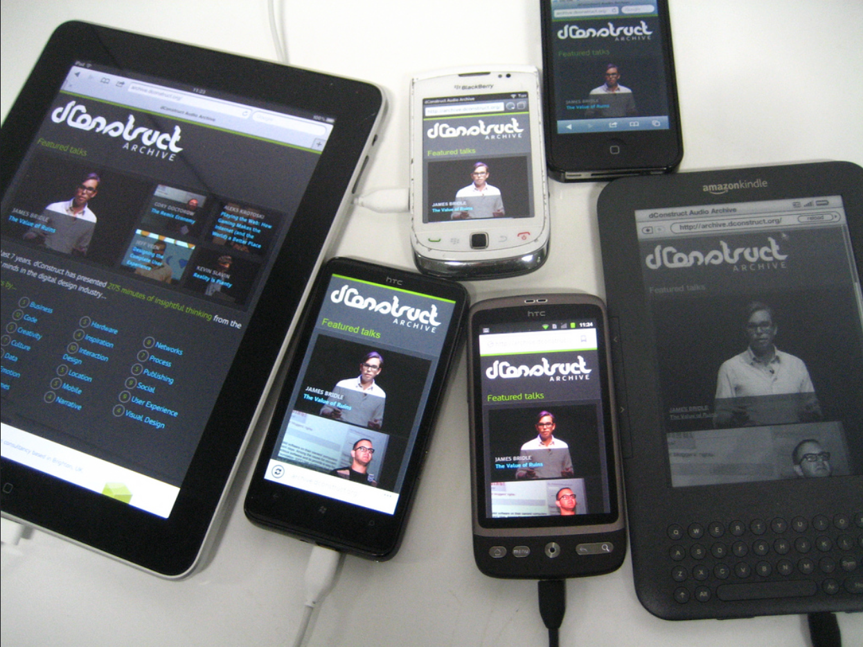
Photo taken by Jeremy Keith.
Introducing media queries
Nowadays, the common media types we use are screen and print. Other options are handheld, projection, tv. The media type all means it apply to all media types where the web page is displayed.
For example, in the simple grid system I introdcued in chapter 3, it defines a media query that change the columns into 100% when the screen size is smaller than or equely to 400px;
CSS styles that’s defined inside media query scope apply only when the media query matches the conditions.
Media Queries for Standard Devices by CSS-tricks.
 1// Small screens
 2@media only screen { } /* Define mobile styles */
 3
 4@media only screen and (max-width: 40em) { } /* max-width 640px, mobile-only styles, use when QAing mobile issues */
 5
 6// Medium screens
 7@media only screen and (min-width: 40.063em) { } /* min-width 641px, medium screens */
 8
 9@media only screen and (min-width: 40.063em) and (max-width: 64em) { } /* min-width 641px and max-width 1024px, use when QAing tablet-only issues */
10
11// Large screens
12@media only screen and (min-width: 64.063em) { } /* min-width 1025px, large screens */
13
14@media only screen and (min-width: 64.063em) and (max-width: 90em) { } /* min-width 1025px and max-width 1440px, use when QAing large screen-only issues */
15
16// XLarge screens
17@media only screen and (min-width: 90.063em) { } /* min-width 1441px, xlarge screens */
18
19@media only screen and (min-width: 90.063em) and (max-width: 120em) { } /* min-width 1441px and max-width 1920px, use when QAing xlarge screen-only issues */
20
21// XXLarge screens
22@media only screen and (min-width: 120.063em) { } /* min-width 1921px, xxlarge screens */
23
Note: Another way to apply the media queries.
1<link href="css/mobile.css" rel="stylesheet" type="text/css" media="only screen and (max-width: 649px)" >
Media is not limited to screen. We can also define rules that applies only when printing.
Note: we also need to set a viewport meta for mobile device to work. It forces the mobile device to use device width. Otherwise, mobile phone may set the initial viewport to desktop width, resulting your website in very small scale.
1<meta name="viewport" content="width=device-width">
Foundation grid system
As introduced in previous chapters, we have grid system in foundation like the following:
The small-x classes is the essential one. The medium-x and large-x is needed only when we want to sepecific set a different layout for the larger screens.
Here is the guide from the Foundation documentation:
Foundation is mobile-first. Code for small screens first, and larger devices will inherit those styles. Customize for larger screens as necessary.
Why mobile first?
We design website for mobile first because:
- We can focus on the most important thing.
- We must carefully choose what to show in such a small screen.
- If eventually we do not have time for the desktop layout, the mobile one works everywhere.
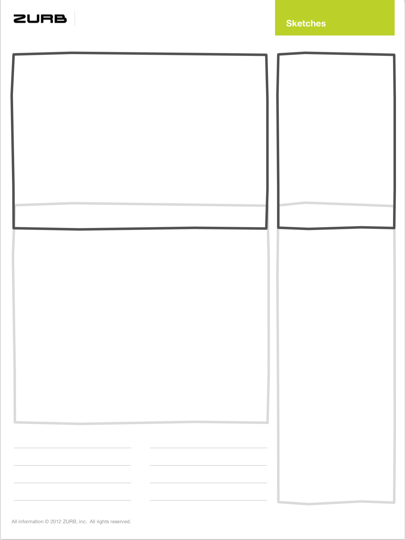
Drawing mobile sketch

We have implemented a website in last chapter:
Now try to draw the website layout on paper. Sketching how elements lay out in a small screen. We will be using a responsive sketchsheets from Zurb.
Optimizing font-size
If you resize this web page, you may notice that the font size changes. Here is the exactly source code snippet for the font size.
 1/* Scss */
 2$font-break-point-wide: 900px;
 3$font-break-point-medium: 800px;
 4$font-break-point-narrow: 700px;
 5$break-point: 560px;
 6
 7body {
 8  font-size: 21px;
 9  font-family: Georgia, serif;
10  line-height: 150%;
11
12  @media (max-width: $font-break-point-wide) {
13    font-size: 21px;
14  }
15  @media (max-width: $font-break-point-medium) {
16    font-size: 19px;
17  }
18  @media (max-width: $font-break-point-narrow) {
19    font-size: 18px;
20  }
21  @media (max-width: $break-point) {
22    font-size: 16px;
23  }
24
25  /* iPhone Retina */
26  @media only screen and (-webkit-min-device-pixel-ratio : 1.5) and (max-width: $break-point), only screen and (min-device-pixel-ratio : 1.5) and (max-width: $break-point) {
27    font-size: 16px;
28  }
29}
Please note that the code above is Scss. In Scss, we can put @media condition directily inside another scope. This is much straightforward when we adjust the same property of one selector across different screen sizes.
Further reading: Responsive Typography: The Basics by iA.
Responsive copywriting
It's not only about layout. We should also take care of our copywritings.
An example on Basecamp homepage.
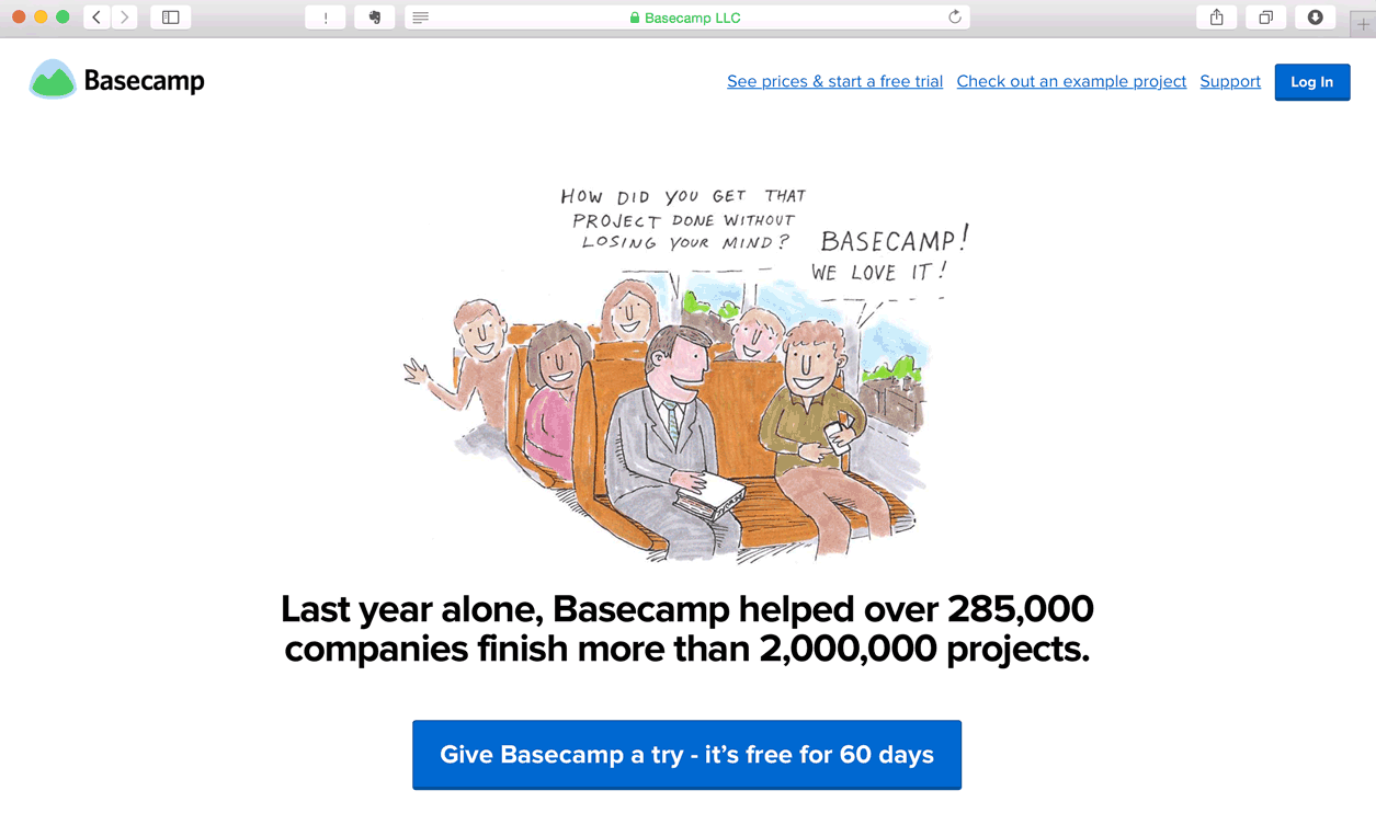
Take a closer look on the top navigation. When the screen has more space, the copywriting of sign-up button is See prices & start a free trial”, detail enough so I know what information to expect after the link, right? When the screen has less space, this link changes to a simply “Sign up” text. Short and precise enough.
Another example from the same company. Take a look at the top sentense.
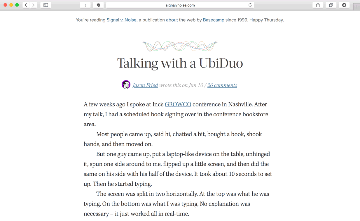
When wide enough, it shows: “You’re reading Signal v. Noise, a publication about the web by Basecamp since 1999. Happy Thursday.”
When it’s not wide enough, it shows: “Signal v. Noise, a publication about the web by Basecamp since 1999.”
In extreme case that the screen is too narrow, it displays: “Signal v. Noise by Basecamp”
With Foundation, we can archive the same result by using the visibility utility classes.
Foundation’s visibility on various screens
1<p class="panel">
2  <strong class="show-for-small-only">This text is shown only on a small screen.</strong>
3  <strong class="show-for-medium-up">This text is shown on medium screens and up.</strong>
4  <strong class="show-for-medium-only">This text is shown only on a medium screen.</strong>
5  <strong class="show-for-large-up">This text is shown on large screens and up.</strong>
6  <strong class="show-for-large-only">This text is shown only on a large screen.</strong>
7</p>
Re-create a heading like the Signal v. Noise website.
Interchange responsize content
Responsive design comes with a downside: It wastes (mobile data) bandwidth if a lot of information is hidden in small screen. And it slows down the page loading.
An optimal way to archive the same effect is by using interchange. We use javascript to load the image at the size that fits the reader's screen. Smaller image for small screen. Higher resolution image for larger screen. The readers only need to load what they are going to read. They should never load something that they don't see and use.
The reason we need to interchange content is because of the loading bandwidth. In the visibility section, we show and hide content based on the screen size. But the reader have to download all the content. Assuming the reader is reading on mobile but we load a large image for large screen reader. Then the mobile reader needs to download a high resolution image with the cecular data but never see this image.
Foundation’s interchange content
Exercise: Try to implement an interchange image.
If the page is generated by server logic, we can put this interchange code snippet into a server-side rendering funciton. For example, if it’s ruby, we may have the following code:
Or we can further simlify the the function by using convention. Assuming the large screen name is always <name>-large and the function is for jpg only.
Navigation strategy
There are different approaches to display navigation in small screen.
Using block grid
Footer navigation
 1<header id='top'>
 2  <h1>Demo on footer navigation strategy</h1>
 3</header>
 4<nav>
 5  <ul class='small-block-grid-4 hide-for-small-only'>
 6    <li><a href='#'>Home</a></li>
 7    <li><a href='#'>About</a></li>
 8    <li><a href='#'>Works</a></li>
 9    <li><a href='#'>Contact</a></li>
10  </ul>
11  <p class='show-for-small-only'><a href='#footer-nav'>Menu</a></p>
12</nav>
13<article>
14  <p>A long text here.</p>
15</article>
16<footer>
17  <nav id='footer-nav'>
18    <ul>
19      <li><a href='#top'>Top</a></li>
20      <li><a href='#'>Home</a></li>
21      <li><a href='#'>About</a></li>
22      <li><a href='#'>Works</a></li>
23      <li><a href='#'>Contact</a></li>
24    </ul>
25  </nav>
26</footer>
27
Exercise: follow the code snippet above. Modify the navigation to make it work in small screen.
Hamburger link
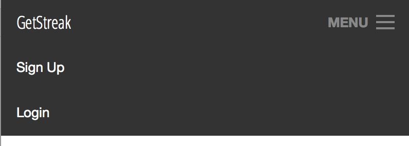
Exercise: Use Foundation’s top bar component to create an navigation that changes into hamburger menu when in small screen.
 1<nav class="top-bar" data-topbar="">
 2  <ul class="title-area">
 3    <li class="name">
 4      <h1><a href="/">Website Title</a></h1>
 5    </li>
 6    <li class="toggle-topbar menu-icon">
 7      <a href="#"><span>Menu</span></a>
 8    </li>
 9  </ul>
10  <section class="top-bar-section">
11    <ul class="left">
12    </ul>
13    <ul class="right">
14      <li><a href="/users/sign_up">Sign Up</a></li>
15      <li><a href="/users/sign_in">Login</a></li>
16    </ul>
17  </section>
18</nav>

Further reading: Foundation provides another navigation approach that slides in the menu when the hamburger button is clicked. They call it Offcanvas.
Further reading 2: Disprite the popularity of the hamburger button, more and more designer considering it as harmful to user interaction: Kill The Hamburger Button. Think twice before you really need to use the hamburger.
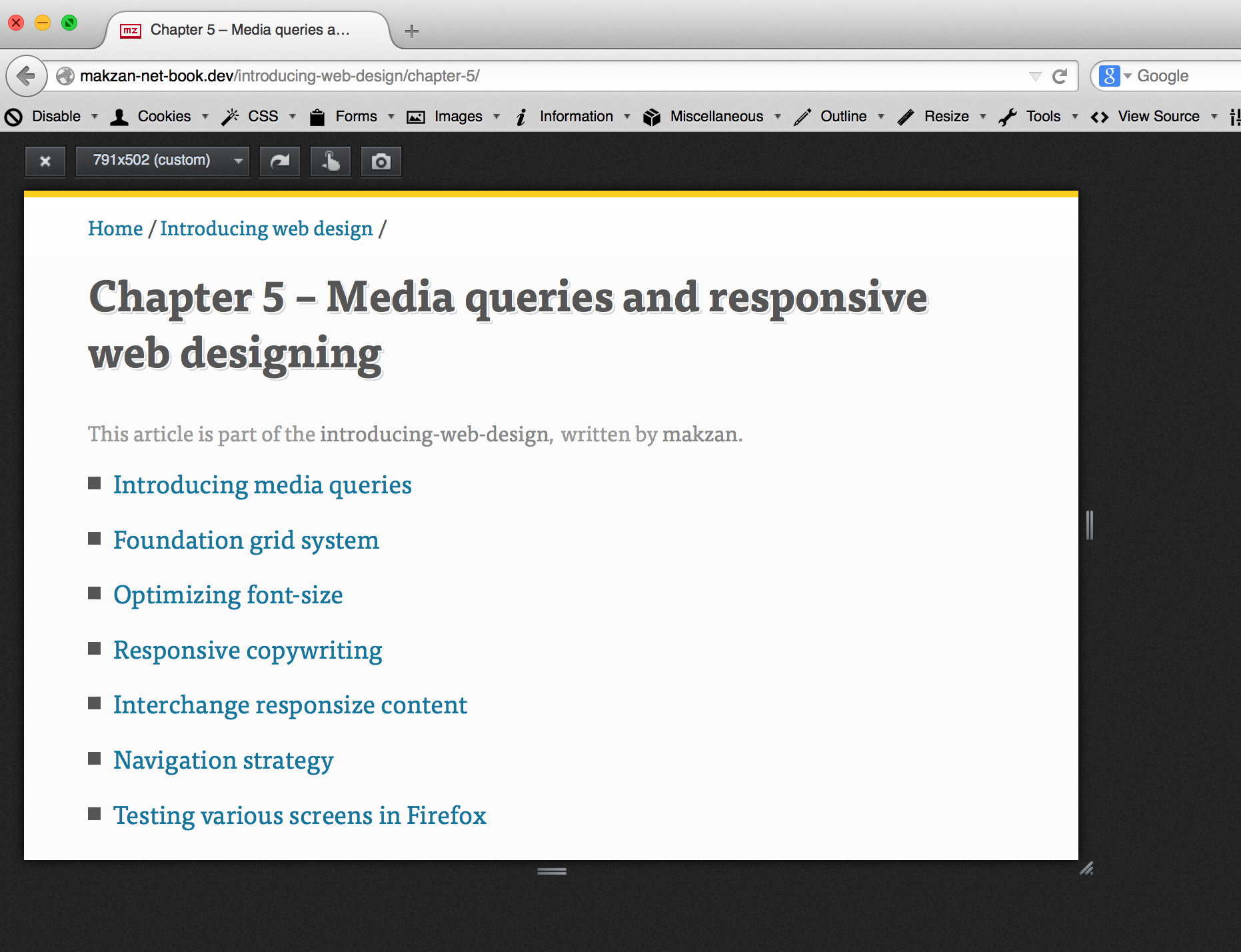
Testing various screens in Firefox
Firefox comes with a tool to test the website in various screen sizes. You may find it in Tools | Web Developer | Responsive Design View.
Other tools that we may use:
Using simulator to test websites
Testing small screen website in browser simulation is not enough. Mobile devices come with different resolution, different pixel density. In order to really make things work in mobile, we need to use real devices. Or at least, we need to use device simulator.
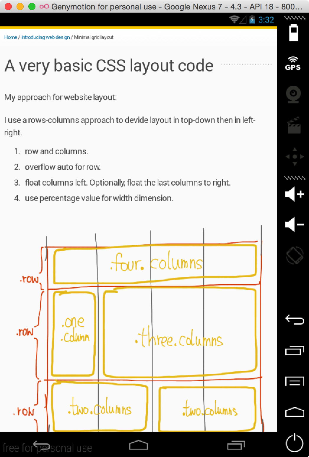
For Android, we may use Genymotion to simulate different system versions from different brands.
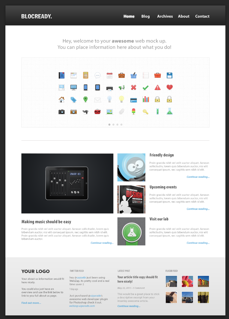
Foundation and jsFiddle template
Note: If you want to experiement Foundation in jsFiddle, you’ll need to include the CSS and JavaScript. The fiddle should also selected to use jQuery where Foundation depends on it.
http://www.cdn.jsdelivr.net/foundation/5.2.3/css/foundation.min.css
http://www.cdn.jsdelivr.net/foundation/5.2.3/js/foundation.min.js
Or you may start in the following fiddle where I have included the Foundation resources.
Conclusion: Foundation’s responsive rule of thumb
- Always put
.columnsinside.row - Sum of columns equals to 12 inside one row
large-Nfor defining columns in large screensmall-Nto specify small screen columns- by default a column is large-12/small-12 (full width)
display-for-small/hide-for-largefor screen size sensitive components.