Table of Content
Navigation strategy for small screen
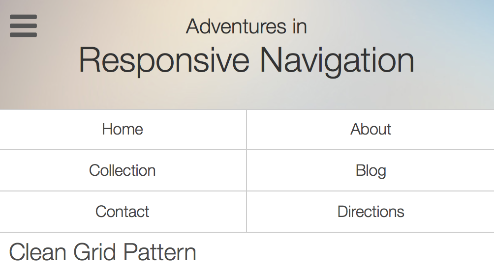
In small screen, we used to hide navigation to provide enough screen space for the main content.
There are several approaches:
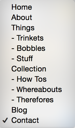
- Dropdown select
- Hamburger menu
- Slide down
- Footer navigation

You may find this essay about popular trends on navigation pattern from Jake Rocheleau.
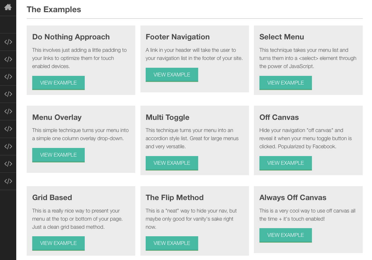
Also, there are a collection of patterns in this ResponsiveNavigation.com.


Extra: Brad Frost has written two articles on the patterns with pros and cons on each navigation pattern:
What’s next? We’re going to take a look at “Putting navigation at bottom”.
