Table of Content
Content structure
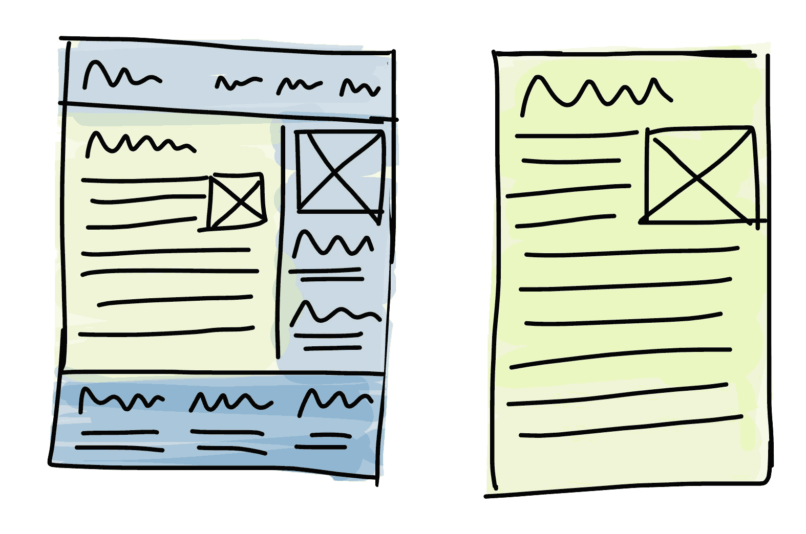
The first step is not make your website fit in mobile. The first thing you should do is make your content fits in the mobile device.
Remember, people don’t consume website. They consume content.
There is an article view in mobile Safari. The iOS parsed the web page and try to extract the content for a better reading experience.
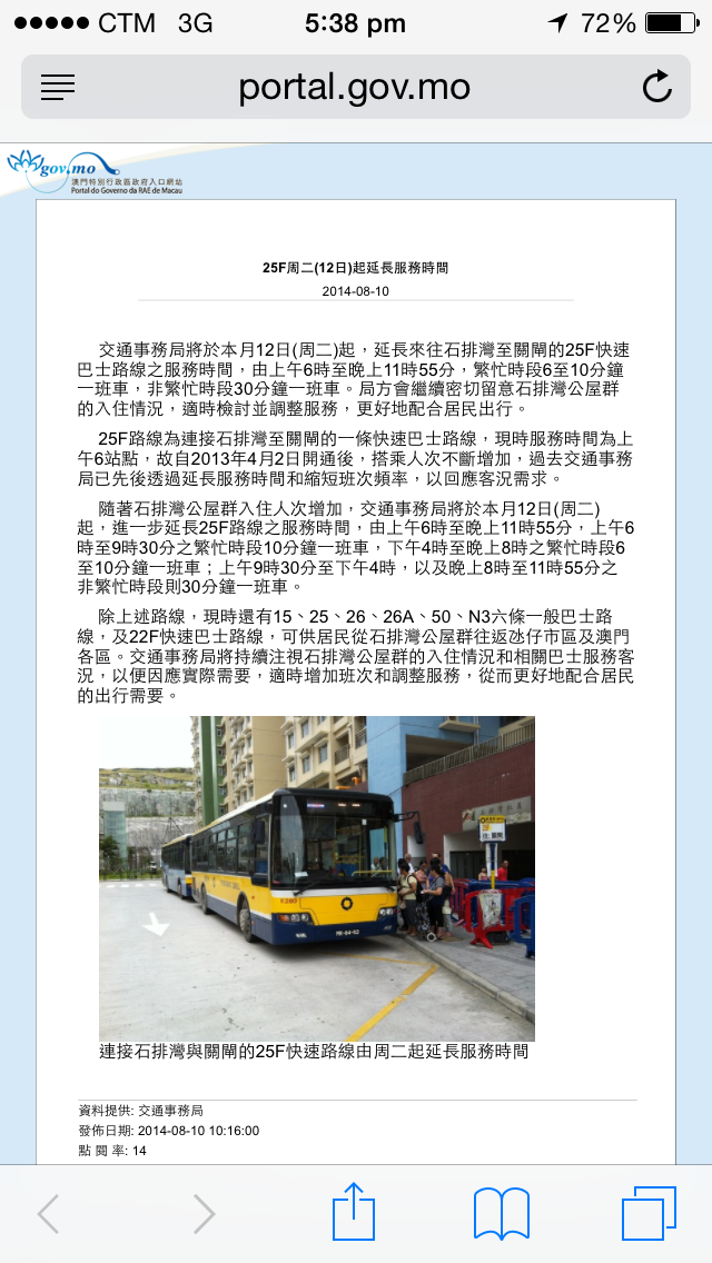
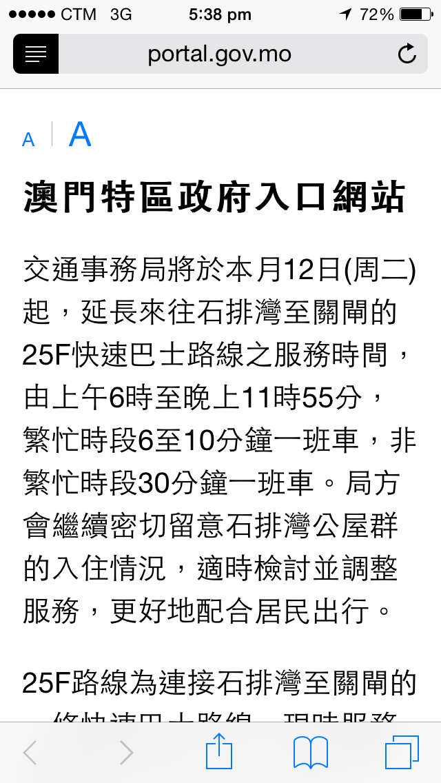
Moreover, most read-later service also supports content extraction. For example, the following screenshot shows how Pocket displays the content in its mobile app, with a good reading experience.

Another example:


Similar article view is not only use in mobile but also desktop service, such as Evernote.
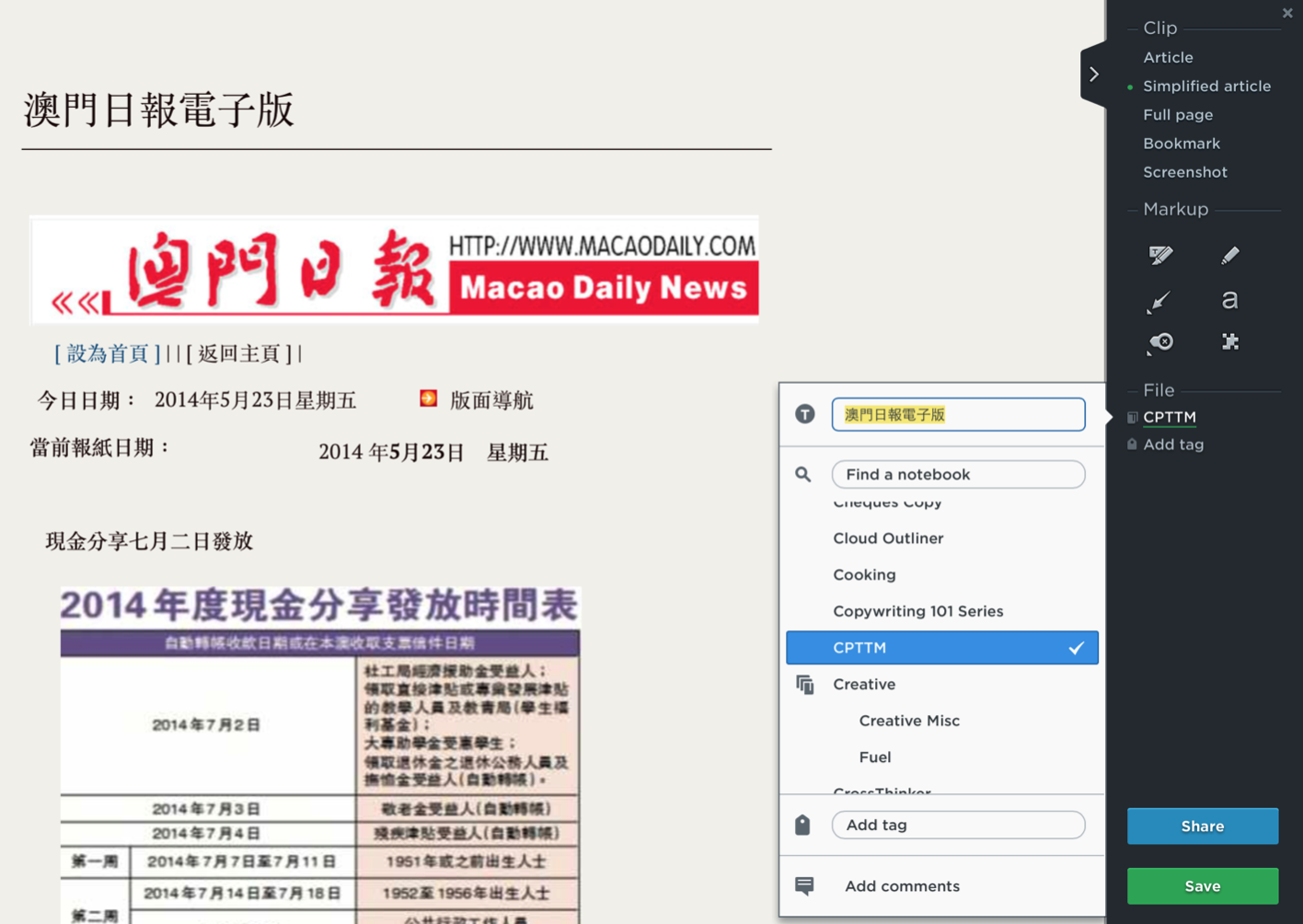
So how we could make the system or service extract the content correctly?
When we plan our HTML structure, we can make use of the <article> tag. Here is the explanation from Mozilla.
The HTML
<article>Element represents a self-contained composition in a document, page, application, or site, which is intended to be independently distributable or reusable, e.g., in syndication.
It’s often confusing when deciding when to use the section tag and when to use the article tag.
Good structure helps web service analysis your content.
Two quotes from the w3 spec helping us to choose between section and article.
Authors are encouraged to use the article element instead of the section element when it would make sense to syndicate the contents of the element.
When an element is needed for styling purposes or as a convenience for scripting, authors are encouraged to use the div element instead. A general rule is that the section element is appropriate only if the element's contents would be listed explicitly in the document's outline.
What’s next? We’re going to take a look at “Mobile first approach”.
