Block grid

Foundation provides small-block-grid-N, medium-block-grid-N and large-block-grid-N. It’s very convinent when we need to spread the content evenly inside a space.
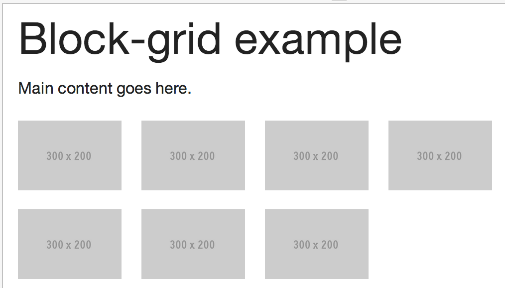
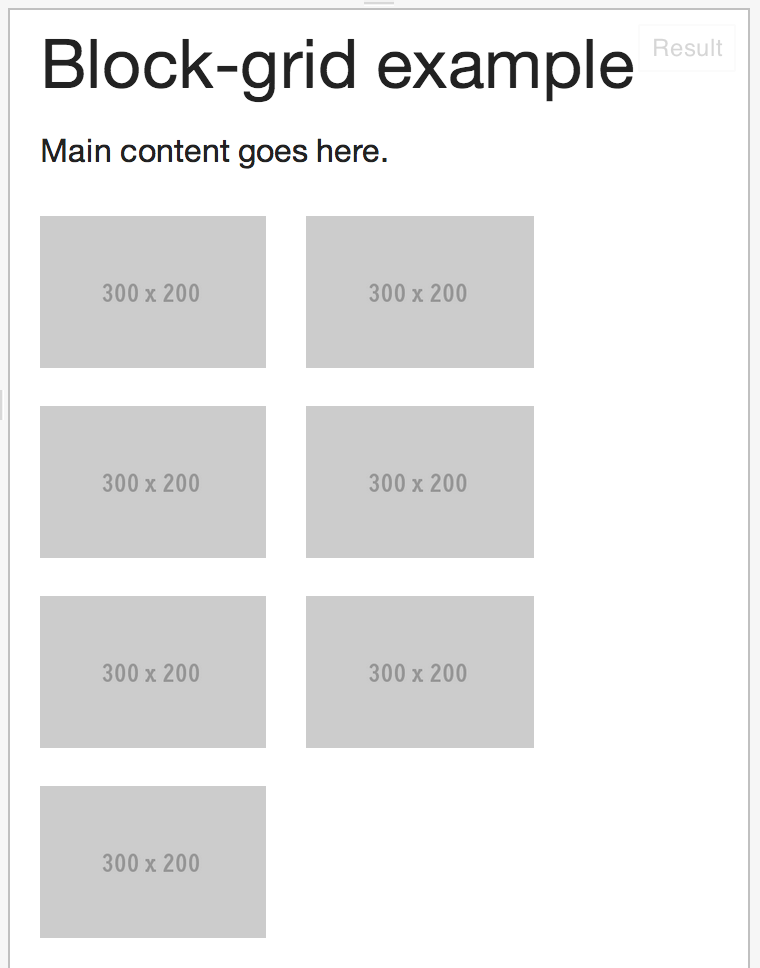
1<ul class="small-block-grid-2 medium-block-grid-4">
2  <li><img src="http://placehold.it/300x200" alt="placeholder" /></li>
3  ...
4  <li><img src="http://placehold.it/300x200" alt="placeholder" /></li>
5</ul>

Block grid displayed in wide screen.

Block grid displayed in small screen.

What’s next? We’re going to take a look at “Flex video”.

overlaied image when clicked on thumbnail

Makzan | Mobile web design | Table of Content