Table of Content
Books-to-buy Mockup
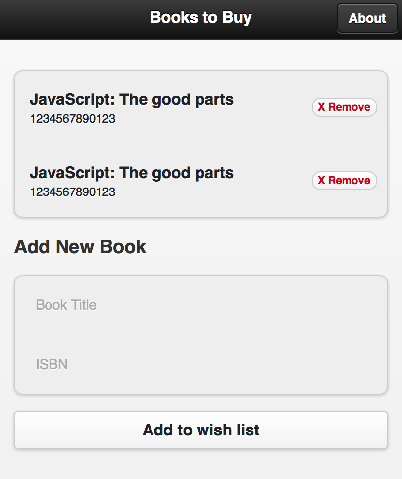
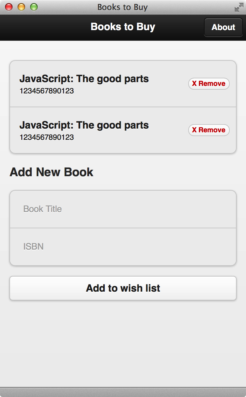
The following is the mock up of the app that we will create before adding any javascript logic.

For a mockup, we will have some dummy data hard coded in the view to preview how it looks like.
 1<div data-role='page' id='root'>
 2  <div data-role='header'>
 3    <h1>Books to Buy</h1>
 4    <a class='ui-btn-right' data-role='button' data-transition='slide' href='#about'>About</a>
 5  </div>
 6  <div data-role='content'>
 7    <ul data-role='listview' data-inset='true'>
 8      <li>
 9        <h1>JavaScript: The good parts</h1>
10        <p>1234567890123</p>
11        <p class='ui-li-count'><a href='#' class='delete-btn' data-isbn='1234567890'>X Remove</a></p>
12      </li>
13      <li>
14        <h1>JavaScript: The good parts</h1>
15        <p>1234567890123</p>
16        <p class='ui-li-count'><a href='#' class='delete-btn' data-isbn='1234567890'>X Remove</a></p>
17      </li>
18    </ul>
19    <h3>Add New Book</h3>
20    <ul data-role='listview' data-inset='true'>
21      <li><input type='text' data-mini='true' id='book-title' placeholder='Book Title'></li>
22      <li><input type='text' data-mini='true' id='book-isbn' placeholder='ISBN'></li>
23    </ul>
24    <input type='button' value='Add to wish list' id='add-book-btn'>
25  </div>
26</div>
The inset of list view is good for showing the grouping effect. When putting two lists together with both inset turned on, It looks like two sections of information from the same list. In our example, the first section is the books list and the second section is the input fields.
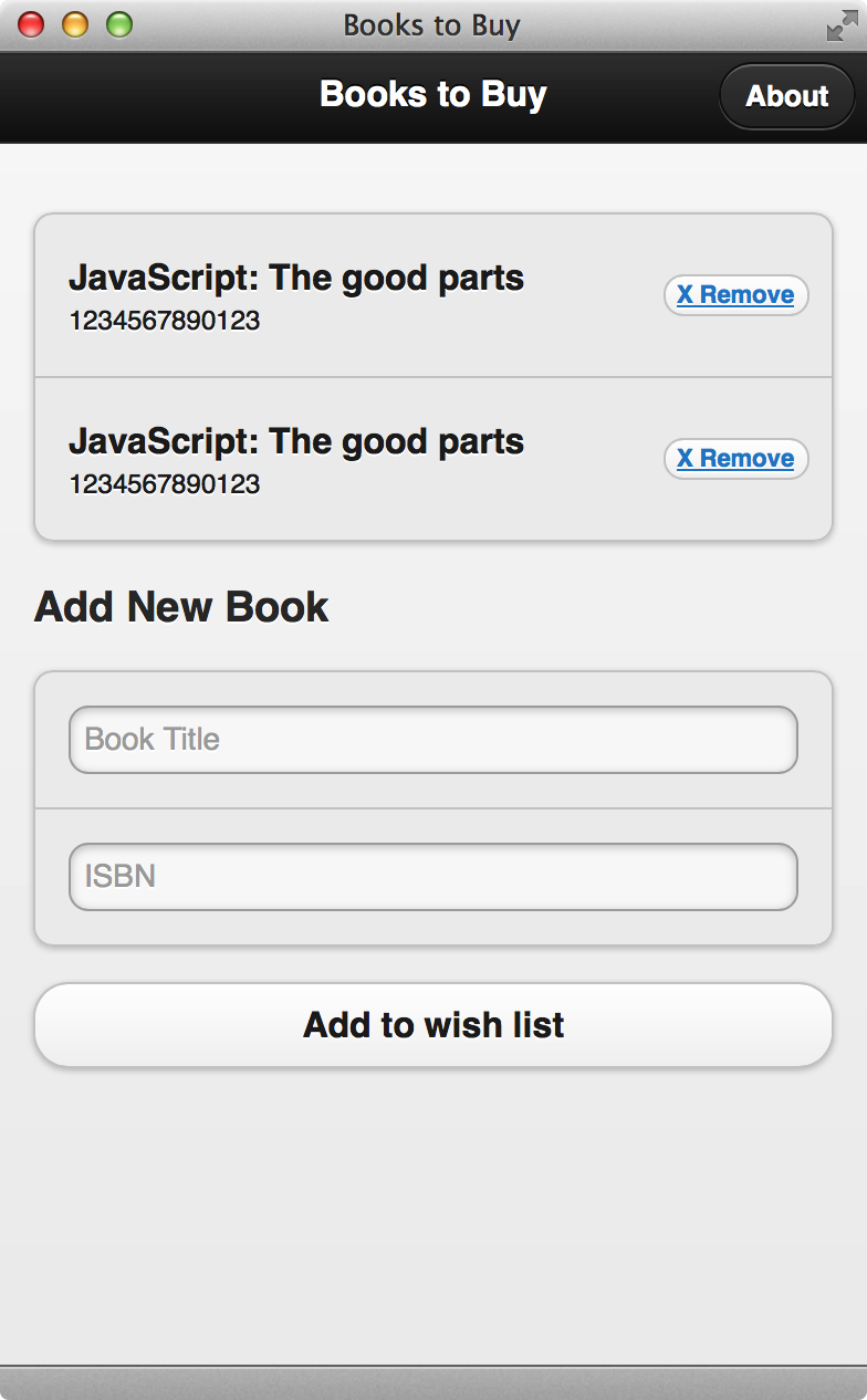
Since now we put the input fields inside table, we need to override some CSS to make the inputs look good.
 1.ui-input-text, .ui-input-text.ui-focus {
 2  background: none;
 3  border: none;
 4  box-shadow: none;
 5}
 6
 7.ui-btn {
 8  border-radius: 5px;
 9}
10
11a.delete-btn, a.delete-btn.ui-link {
12  text-decoration: none;
13  color: #cc0000;
14}
15a.delete-btn:hover, a.delete-btn.ui-link:hover {
16  color: #ff0000;
17}


What’s next? We’re going to take a look at “Model for adding book”.
